Creating
Colors in a Grey
World

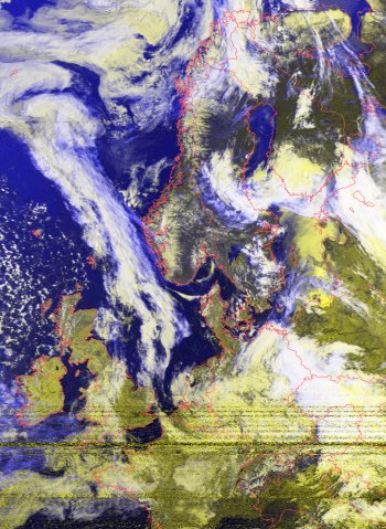
False color image
from NOAA-15 with country outlines.
The
APT visible image data is in grey scale, not color.
That is, a numerical value is assigned to a pixel
(the smallest image element) according to it's brightness.
However,
it's found that similar features tend to have similar
grey values: dark areas correspond to water, medium
grey to land, and light to clouds. Thus, you can assign
blue, green,
white to these respective areas and get a colorful
image that more or less looks plausible.
More
sophisticated algorithms include the IR image data
to provide additional clues to what color to assign
a particular area.
However,
it should be clear that there is a large degree of
"art" to making these color images.
For example, different "color palattes",
i.e. what color is applied to what grey level, will
produce significant differences in the images. Also,
typically, one will apply various filters to the images
to sharpen them and reduce the background noise. In
what sequence the filters and colors are carried out
can result in big variations.
Note
that in the above image, the green areas correspond
fairly well with the land areas. However, just below
Great Britain we see that France has melted out into
the ocean. The grey scale of a mix of clouds and water
were just not sharp enough to avoid this mixup.