Category Archives: Space Science

“The Art of Exoplanets” – The challenge of depicting what has not been seen

Here is a NASA article about how artists create imagery of planets around other stars realistically despite the fact no one has ever seen such an exoplanet up close:

The Art of Exoplanets

The moon hanging in the night sky sent Robert Hurt’s mind into deep space — to a region some 40 light years away, in fact, where seven Earth-sized planets crowded close to a dim, red sun.

This artist’s concept shows what each of the TRAPPIST-1 planets may look like, based on available data about their sizes, masses and orbital distances. Credits: NASA/JPL-Caltech Full image and caption

Hurt, a visualization scientist at Caltech’s IPAC center, was walking outside his home in Mar Vista, California, shortly after he learned of the discovery of these rocky worlds around a star called TRAPPIST-1 and got the assignment to visualize them. The planets had been revealed by NASA’s Spitzer Space Telescope and ground-based observatories.

“I just stopped dead in my tracks, and I just stared at it,” Hurt said in an interview. “I was imagining that could be, not our moon, but the next planet over – what it would be like to be in a system where you could look up and see continental features on the next planet.”

So began a kind of inspirational avalanche. Hurt and his colleague, multimedia producer Tim Pyle, developed a series of arresting, photorealistic images of what the new system’s tightly packed planets might look like — so tightly packed that they would loom large in each other’s skies. Their visions of the TRAPPIST-1 system would appear in leading news outlets around the world.

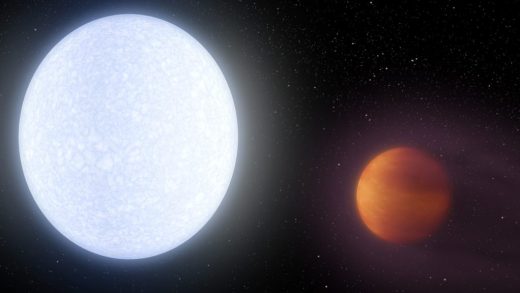
Artists like Hurt and Pyle, who render vibrant visualizations based on data from Spitzer and other missions, are hybrids of sorts, blending expertise in both science and art. From squiggles on charts and columns of numbers, they conjure red, blue and green worlds, with half-frozen oceans or bubbling lava. Or they transport us to the surface of a world with a red-orange sun fixed in place, and a sky full of planetary companions.

“For the public, the value of this is not just giving them a picture of something somebody made up,” said Douglas Hudgins, a program scientist for the Exoplanet Exploration Program at NASA Headquarters in Washington. “These are real, educated guesses of how something might look to human beings. An image is worth a thousand words.”

This artist’s concept by Tim Pyle allows us to imagine what it would be like to stand on the surface of the exoplanet TRAPPIST-1f, located in the TRAPPIST-1 system in the constellation Aquarius. Credits: NASA/JPL-Caltech. Full image and caption

Hurt says he and Pyle are building on the work of artistic pioneers.

“There’s actually a long history and tradition for space art and science-based illustration,” he said. “If you trace its roots back to the artist Chesley Bonestell (famous in the 1950s and ’60s), he really was the artist who got this idea: Let’s go and imagine what the planets in our solar system might actually look like if you were, say, on Jupiter’s moon, Io. How big would Jupiter appear in the sky, and what angle would we be viewing it from?”

To begin work on their visualizations, Hurt divided up the seven TRAPPIST-1 planets with Pyle, who shares an office with him at Caltech’s IPAC center in Pasadena, California.

This illustration shows one possible scenario for the hot, rocky exoplanet called 55 Cancri e, which is nearly two times as wide as Earth. Robert Hurt created this in 2016. Credits: NASA/JPL-Caltech. Full image and caption

Hurt holds a Ph.D. in astrophysics, and has worked at the center since he was a post-doctoral researcher in 1996 – when astronomical art was just his hobby.

“They created a job for me,” he said.

Pyle, whose background is in Hollywood special effects, joined Hurt in 2004.

NASA’s Kepler mission discovered a world where two suns set over the horizon instead of just one, called Kepler-16b. Robert Hurt did this illustration of this fascinating world. Credits: NASA/JPL-Caltech. Full image and caption

Hurt turns to Pyle for artistic inspiration, while Pyle relies on Hurt to check his science.

“Robert and I have our desks right next to each other, so we’re constantly giving each other feedback,” Pyle said. “We’re each upping each other’s game, I think.”

The TRAPPIST-1 worlds offered both of them a unique challenge. The two already had a reputation for illustrating many exoplanets – planets around stars beyond our own — but never seven Earth-sized worlds in a single system. The planets cluster so close to their star that a “year” on each of them — the time they take to complete a single orbit — can be numbered in Earth days.

And like the overwhelming majority of the thousands of exoplants found in our galaxy so far, they were detected using indirect means. No telescope exists today that is powerful enough to photograph them.

This artist’s concept by Tim Pyle shows what the weather might look like on cool star-like bodies known as brown dwarfs. Credits: NASA/JPL-Caltech/University of Western Ontario/Stony Brook University. Full image and caption

Real science informed their artistic vision. Using data from the telescopes that reveal each planet’s diameter as well as its “weight,” or mass, and known stellar physics to determine the amount of light each planet would receive, the artists went to work.

Both consulted closely with the planets’ discovery team as they planned for a NASA announcement to coincide with a report in the journal Nature.

“When we’re doing these artist’s concepts, we’re never saying, ‘This is what these planets actually look like,’” Pyle said. “We’re doing plausible illustrations of what they could look like, based on what we know so far. Having this wide range of seven planets actually let us illustrate almost the whole breadth of what would be plausible. This was going to be this incredible interstellar laboratory for what could happen on an Earth-sized planet.”

For TRAPPIST-1b, Pyle took Jupiter’s volcanic moon, Io, as an inspiration, based on suggestions from the science team. For the outermost world, TRAPPIST-1h, he chose two other Jovian moons, the ice-encased Ganymede and Europa.

This artist’s concept shows planet KELT-9b orbiting its host star, KELT-9. It is the hottest gas giant planet discovered so far. Credits: NASA/JPL-Caltech. Full image and caption

After talking to the scientists, Hurt portrayed TRAPPIST-1c as dry and rocky. But because all seven planets are probably tidally locked, forever presenting one face to their star and the other to the cosmos, he placed an ice cap on the dark side.

TRAPPIST-1d was one of three that fall inside the “habitable zone” of the star, or the right distance away from it to allow possible liquid water on the surface.

“The researchers told us they would like to see it portrayed as something they called an ‘eyeball world,’” Hurt said. “You have a dry, hot side that’s facing the star and an ice cap on the back side. But somewhere in between, you have (a zone) where the ice could melt and be sustained as liquid water.”  

At this point, Hurt said, art intervened. The scientists rejected his first version of the planet, which showed liquid water intruding far into the “dayside” of TRAPPIST-1d. They argued that the water would most likely be found well within the planet’s dark half.

“Then I kind of pushed back, and said, ‘If it’s on the dark side, no one can look at it and understand we’re saying there’s water there,’”

Hurt said. They struck a compromise: more water toward the dayside than the science team might expect, but a better visual representation of the science.

This artist’s concept by Tim Pyle depicts Kepler-186f, the first validated Earth-size planet to orbit a distant star in the habitable zone — a range of distance from a star where liquid water might pool on the planet’s surface. Credits: NASA/Ames/SETI Institute/JPL-Caltech. Full image and caption

The same push and pull between science and art extends to other forms of astronomical visualization, whether it’s a Valentine’s Day cartoon of a star pulsing like a heart in time with its planet, or materials for the blockbuster announcement of the first detection of gravitational waves by the Laser Interferometer Gravitational-Wave Observatory in February 2016. They’ve also illustrated asteroids, neutron stars, pulsars and brown dwarfs.

Visualizations based on data can also inform science, leading to genuine scientific insights. The scientists’ conclusions about TRAPPIST-1 at first seemed to suggest the planets would be bathed in red light, potentially obscuring features like blue-hued bodies of water.

“It makes it hard to really differentiate what is going on,” Hurt said.

Hurt decided to investigate. A colleague provided him with a spectrum of a red dwarf star similar to TRAPPIST-1. He overlaid that with the “responsivity curves” of the human eye, and found that most of the scientists’ “red” came from infrared light, invisible to human eyes. Subtract that, and what is left is a more reddish-orange hue that we might see standing on the surface of a TRAPPIST-1 world — “kind of the same color you would expect to get from a low-wattage light bulb,” Hurt said. “And the scientists looked at that and said, ‘Oh, ok, great, it’s orange.’ When the math tells you the answer, there really isn’t a lot to argue about.”

For Hurt, the real goal of scientific illustration is to excite the public, engage them in the science, and provide a snapshot of scientific knowledge.

“If you look at the whole history of space art, reaching back many, many decades, you will find you have a visual record,” he said. “The art is a historical record of our changing understanding of the universe. It becomes a part of the story, and a part of the research, I think.”

For more information on exoplanets, visit:  https://exoplanets.nasa.gov

Written by Pat Brennan

Video: “The Golden Age of Exploration” – Talk by NASA JPL director Charles Elachi

Charles Elachi, Caltech professor and JPL director (2001-2016),

describes the excitement and impact of discoveries made by JPL’s robotic missions at destinations around the solar system and beyond over the past 15 years—from rovers and orbiters at Mars to Cassini at Saturn to discoveries about planets around other stars.


Satellites launched into orbit from the ISS, includes QB50 Mission student CubeSats

This week over a dozen small satellites called CubeSats have been injected into orbit from the International Space Station using a system developed by NanoRacks. This video of the deployment of a NASA satellite on Tuesday:

A description of the satellites being sent into orbit is given in CubeSat Deployer Mission 11 Status Update: Good Deploy! – NanoRacks.

A cubesat is shot into orbit from the ISS; Credits NanoRacks.

The deployments included satellites from the QB50 Mission

The QB50 Mission consists of dozens of universities located around the world – including Israel, Canada, Australia, Korea, Spain, Germany, France and more. Coordinated by the von Karman Institute and sponsored by the European Commission, the QB50 CubeSats will take advantage of the space station orbit to study the lower thermosphere (200-380 kilometers) collecting scientific climate data, in what is considered by experts a relatively unexplored part of Earth’s atmosphere.

The ISS portion of the QB50 Mission involves over 300 students and 50 professionals, which brings the program together.

Astronaut Thomas Pesquet tells us about the QB50 Mission being deployed via NanoRacks and our NRCSD (NanoRacks CubeSat Deployer) on the International Space Station.


Video: Carl Sagan, Ann Drujan, and the Voyagers

A nicely made video homage from Penny Lane to Carl Sagan, Ann Druyan and the Voyager missions: A film about Carl Sagan, Annie Druyan and a love letter they sent to the stars | Aeon Videos –

A film about Carl Sagan, Annie Druyan and a love letter they sent to the stars

In the summer of 1977, NASA sent Voyager 1 and Voyager 2 on an epic journey into interstellar space. Each of the Voyager probes carries a golden record, a compilation of images and sounds meant to represent our planet to any distant civilisations that should encounter them. ‘The launching of this bottle into the cosmic ocean says something very hopeful about life on this planet,’ said Carl Sagan, the golden record’s co-creator. Sagan met and fell madly in love with his future wife Ann Druyan while working on the golden record. The project became their love letter to humankind and to each other.

Director: Penny Lane

New night lights maps of the earth released by NASA

NASA has recently released new improved images and video of night-time views of the earth’s surface lighting.

New Night Lights Maps Open Up Possible Real-Time Applications

NASA scientists have just released the first new global map of Earth at night since 2012. By studying Earth at night, researchers can investigate how cities expand, monitor light intensity to estimate energy use and economic activity, and aid in disaster response.
Credits: NASA’s Goddard Space Flight Center/Kathryn Mersmann

NASA scientists are releasing new global maps of Earth at night, providing the clearest yet composite view of the patterns of human settlement across our planet.

Satellite images of Earth at night — often referred to as “night lights” — have been a gee-whiz curiosity for the public and a tool for fundamental research for nearly 25 years. They have provided a broad, beautiful picture, showing how humans have shaped the planet and lit up the darkness. Produced every decade or so, such maps have spawned hundreds of pop-culture uses and dozens of economic, social science and environmental research projects.

These three composite images provide full-hemisphere views of Earth at night. The clouds and sun glint — added here for aesthetic effect — are derived from MODIS instrument land surface and cloud cover products. Credits: NASA Earth Observatory images by Joshua Stevens, using Suomi NPP VIIRS data from Miguel Román, NASA’s Goddard Space Flight Center Download Americas image – Download Europe and Africa imageDownload Asia and Australia image

But what would happen if night lights imagery could be updated yearly, monthly or even daily? A research team led by Earth scientist Miguel Román of NASA’s Goddard Space Flight Center in Greenbelt, Maryland, plans to find out this year.

In the years since the 2011 launch of the NASA-NOAA Suomi National Polar-orbiting Partnership (NPP) satellite, Román and colleagues have been analyzing night lights data and developing new software and algorithms to make night lights imagery clearer, more accurate and readily available. They are now on the verge of providing daily, high-definition views of Earth at night, and are targeting the release of such data to the science community later this year.

Composite image of continental U.S. at night, 2016. Credits: NASA Earth Observatory images by Joshua Stevens, using Suomi NPP VIIRS data from Miguel Román, NASA’s Goddard Space Flight Center

Since colleagues from the National Oceanic and Atmospheric Administration and NASA released a new Earth at night map in 2012, Román and teammates at NASA’s Earth Observing Satellite Data and Information System (EOSDIS) have been working to integrate nighttime data into NASA’s Global Imagery Browse Services (GIBS) and Worldview mapping tools. Freely available to the science community and the public via the Web, GIBS and Worldview allow users to see natural- and false-color images of Earth within hours of satellite acquisition.

Composite image of Mid-Atlantic and Northeastern U.S. at night, 2016. Credits: NASA Earth Observatory images by Joshua Stevens, using Suomi NPP VIIRS data from Miguel Román, NASA’s Goddard Space Flight Center

Today they are releasing a new global composite map of night lights as observed in 2016, as well as a revised version of the 2012 map (8 MB jpg | 265 MB jpg). The NASA group has examined the different ways that light is radiated, scattered and reflected by land, atmospheric and ocean surfaces. The principal challenge in nighttime satellite imaging is accounting for the phases of the moon, which constantly varies the amount of light shining on Earth, though in predictable ways. Likewise, seasonal vegetation, clouds, aerosols, snow and ice cover, and even faint atmospheric emissions (such as airglow and auroras) change the way light is observed in different parts of the world. The new maps were produced with data from all months of each year. The team wrote code that picked the clearest night views each month, ultimately combining moonlight-free and moonlight-corrected data.

Composite image of Nile River and surrounding region at night, 2016. Credits: NASA Earth Observatory images by Joshua Stevens, using Suomi NPP VIIRS data from Miguel Román, NASA’s Goddard Space Flight Center

Román and colleagues have been building remote sensing techniques to filter out these sources of extraneous light, gathering a better and more consistent signal of how human-driven patterns and processes are changing. The improved processing moves Suomi NPP closer to its full potential of observing dim light down to the scale of an isolated highway lamp or a fishing boat. The satellite’s workhorse instrument is the Visible Infrared Imaging Radiometer Suite (VIIRS), which detects photons of light reflected from Earth’s surface and atmosphere in 22 different wavelengths. VIIRS is the first satellite instrument to make quantitative measurements of light emissions and reflections, which allows researchers to distinguish the intensity, types and the sources of night lights over several years.

Composite image of Europe at night, 2016.

Suomi NPP observes nearly every location on Earth at roughly 1:30 p.m. and 1:30 a.m. (local time) each day, observing the planet in vertical 3000-kilometer strips from pole to pole. VIIRS includes a special “day-night band,” a low-light sensor that can distinguish night lights with six times better spatial resolution and 250 times better resolution of lighting levels (dynamic range) than previous night-observing satellites. And because Suomi NPP is a civilian science satellite, the data are freely available to scientists within minutes to hours of acquisition.

[Chicago and Lake Michigan area in 2016. See NASA posting for comparison with 2012 image of same area.]

[India in 2016. See NASA posting for comparison with 2012 image of same area.]
Armed with more accurate nighttime environmental products, the NASA team is now automating the processing so that users will be able to view nighttime imagery within hours of acquisition. This has the potential to aid short-term weather forecasting and disaster response.

“Thanks to VIIRS, we can now monitor short-term changes caused by disturbances in power delivery, such as conflict, storms, earthquakes and brownouts,” said Román. “We can monitor cyclical changes driven by reoccurring human activities such as holiday lighting and seasonal migrations. We can also monitor gradual changes driven by urbanization, out-migration, economic changes, and electrification. The fact that we can track all these different aspects at the heart of what defines a city is simply mind-boggling.”

For instance, VIIRS detected power outages in the wake of Hurricane Matthew, a major storm that struck the northeastern Caribbean and the southeastern United States in late September 2016. NASA’s Disasters Response team provided the data to colleagues at the Federal Emergency Management Agency; in the future, NASA, FEMA and the Department of Energy hope to develop power outage maps and integrate the information into recovery efforts by first responders.

The NASA team envisions many other potential uses by research, meteorological and civic groups. For instance, daily nighttime imagery could be used to help monitor unregulated or unreported fishing. It could also contribute to efforts to track sea ice movements and concentrations. Researchers in Puerto Rico intend to use the dataset to reduce light pollution and help protect tropical forests and coastal areas that support fragile ecosystems. And a team at the United Nations has already used night lights data to monitor the effects of war on electric power and the movement of displaced populations in war-torn Syria.

In a separate, long-term project, Román is working with colleagues from around the world to improve global and regional estimates of carbon dioxide emissions. The team at NASA’s Global Modeling and Assimilation Office (GMAO) is combining night lights, urban land use data, and statistical and model projections of anthropogenic emissions in ways that should make estimates of sources much more precise.

Related Links

====